Top Tags

Tag adriandaniels.com

Press Release.

The following is a press release that was recently sent to my personal and professional network.  It calls attention to the launch of my personal branding web site as well as a new business venture focusing on information / graphic design.  I’m including this information here as the majority of future posts will center around these two creative endeavors.

The first is the formation of my personal “brand” via the web site www.adriandaniels.com. This is a project that I have been thinking about for nearly a decade and it was only after much thought that I decided to finally push forward with its release.

While www.adriandaniels.com is my primary site, it’s ultimately intended to serve as a jump point for three other portals:

Incubator: (This site!)  A non-fiction / experiential blog that is primarily focused on the generation of new ideas. Incubator incorporates personal and professional experiences and transforms them into formal essays and narratives.

Microcosms: A blog that allows for unrestricted exploration of new concepts in a “fictional” setting.

Pixeldust: A visual portal that shows how my art, design and photography portfolios have evolved over the past six years – and how they will continue to evolve and ultimately improve.

As these sites ultimately encapsulate my creative strengths, this web portfolio is something I collectively call a “Supercharged Creative Exploration”.

The second development that I am very excited about is the launch of a new information (graphic) design firm called Big Generator (www.biggenerator.com). For those of you who have seen examples of my work, you already have an understanding of what information design is all about – visuals that make complex information easier to understand and to use.

I made the decision to launch this part-time endeavor after considerable reflection into my strengths, interests, and values and combined this reflection with more than a decade of experience in graphic design and related disciplines (e.g. computer graphics, illustration, industrial design).

Ultimately, I am interested in doing what I can for my clients whether that need is strict “information design” or is classified under a general “graphic design” classification. In essence, I want to provide quality and effective visual solutions for my clients that simplify understanding and enhance and strengthen the customer experience.
Next II.

I thought of a few other things with respect to 2010 goals …

Japan – One of my travel goals this year is to visit Japan, more specifically Kyoto and/or Tokyo.  Although with the prevalence of shinkensen (bullet trains), I’ll probably visit both!  Japan is somewhere I have always found intriguing and strangely enough,  one place that I feel some remote “connection” to.  While my initial interest in Japan was centered around their advanced railway system, the first chapter in the book I am reading now – “Japan Rising” – seemed to suggest an almost surreal tie to my own personality – a blend of opaqeness, paradoxes, power and purpose.  While I have much more to read, I may explore this connection in more depth in a future post.

Since travel to Japan will likely happen in the summer, my primary goal now is to start learning the written and oral Japanese language.  Today, I purchased Rosetta Stone’s Japanese Level 1 as it is highly rated and thus a good starting point.  I started working on it this evening and am very impressed with the simplicity of the interface and overall design.  After only fifteen minutes in using the software, I am actually able to comprehend simple sentences!  Future posts will be designed to reinforce what I have learned on my own or through the course.

To provide some foundational context, I learned there are four “writing systems”: Kanji, Hiragana, Katakana and Romaji.  Here is a brief description of each writing system from Rosetta Stone:

Kanji (漢字) is used for nouns, parts of adjectives and verbs, and Japanese names.  Hiragana (ひらがな) is used for words that don’t use kanji, in certain word endings, and in place of kanji characters that are difficult to read.  Katakana (カタカナ) is used for foreign words, countries, names, and technical words.  Romaji, which uses the Roman script, is often used for acronyms, company names, foreign words, or as a transliteration of Japanese characters.  Romaji allows learners of Japanese to read Japanese without learning the characters.

Since I am interested in learning the kanji writing system, I will primarily use Rosetta Stone with this method, but will switch to romaji if I can’t grasp what is being said – i.e. for me, it’s sometimes easier to read what is being said vs. a sole reliance upon the audio.

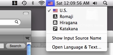
I also configured my Macintosh to switch between U.S. and hiragana (I don’t know exactly why kanji is not listed) through the System Preferences > Language and Text option.  Once configured, you’ll see the relevant language icon located at the top right-hand corner of your screen – as shown here:

When I switch to the hiragana input type, I can start typing in that character set using the set of Japanese typefaces that are installed within Mac OS X.  For example, these are the vowels a, e, i o and u: あえいおう.  I think it will be good experience to learn how to enter these characters as well as to physically write the kanji / hiragana symbols by hand.

Edward Tufte – In my earlier post, I mentioned that I was going to focus more of my attention in the information design realm.  Edward Tufte is considered a pioneer and leader in this space, and thus I recently acquired two of his books – Beautiful Evidence and Envisioning Information.  While I have considerably improved upon my graphic and information design skills over the past decade, I think it’s appropriate to take my development to the next level through books such as this.  I’ve updated my current reading list to include these new additions.

AdrianDaniels.com – With hosting plan finalized, I spent the past week refining the design and ended up taking a completely different approach to the design overall.  I recently posted a placeholder page which represents the overall “look” of the site – the lettering shown is “Adrian” in katakana lettering. If you are interested, you can visit the web site where I was able to obtain this translation.  While the design is nearly complete, I still have a fair amount of work to do in terms of the Flash conversion, thus I’ve set a deadline of February 1 to release the final version.

Incubator – You may have noticed that I’ve changed the title of this blog from “Big Generator” to “Incubator”.  This is actually part of a larger strategy which will be discussed in the upcoming weeks.  In any event, you can now visit this blog via the new URL which is http://incubator.adriandaniels.com.  You can also visit my other site via http://microcosms.adriandaniels.com.  If you have a WordPress blog and are interested in taking advantage of this subdomain mapping, visit this link for details.